Ignite Brewing Co (just for fun)
done for fun
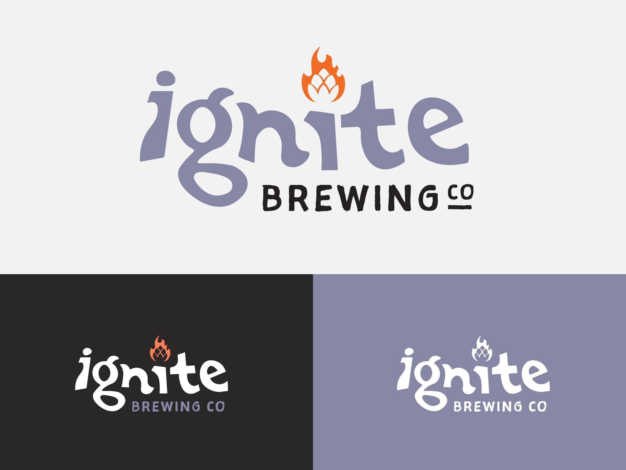
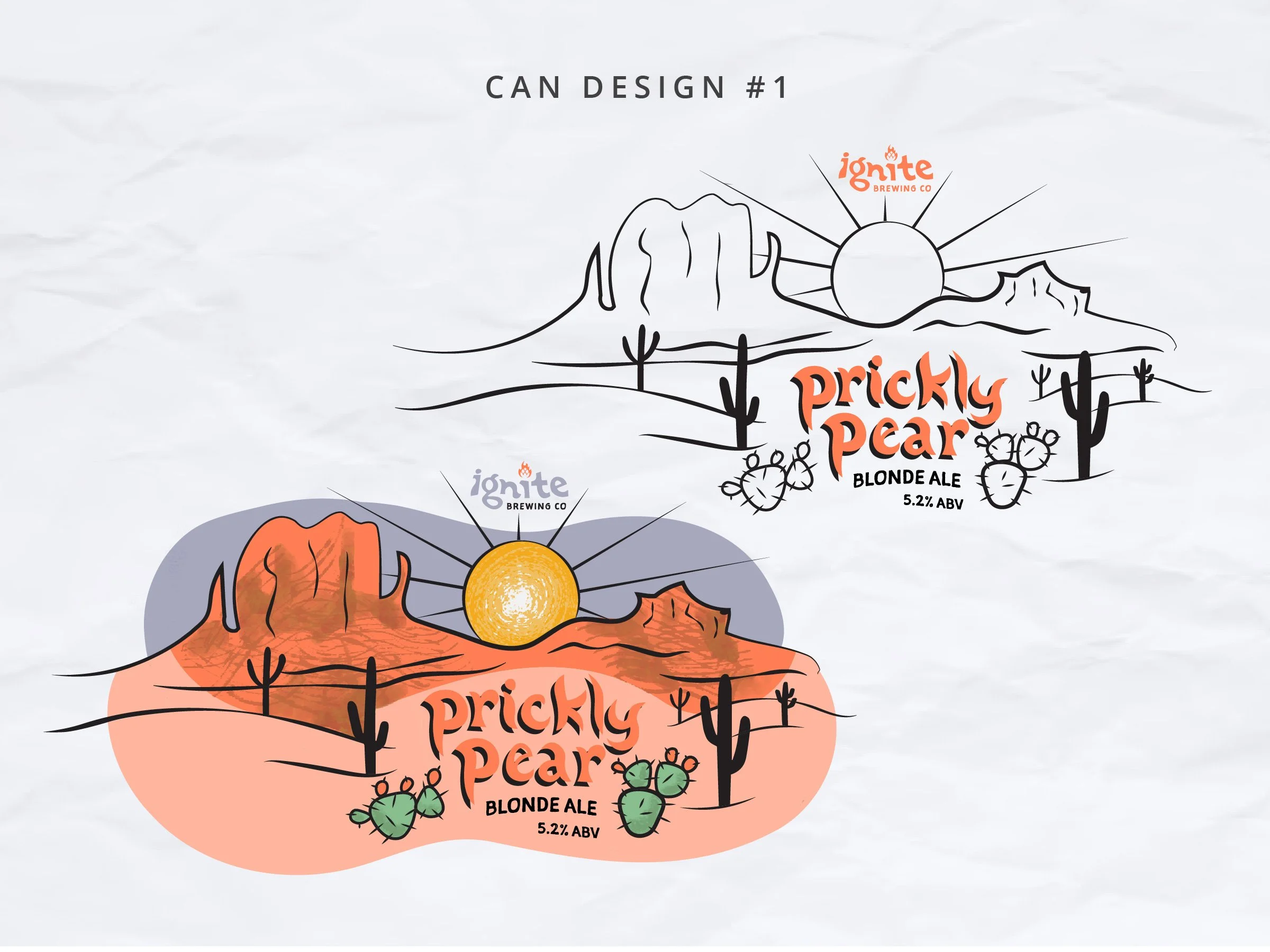
This project was done just for practice & training. That means that you (sadly) won’t find this rebrand in the real world. The reason we completed this was that it gave us an opportunity to work on many aspects of what ties a brand together: illustration, typography, logo, color, package design, and more!
Take a look below and get a peek behind the curtain of what goes through our mind when working with a brand.
we can design it
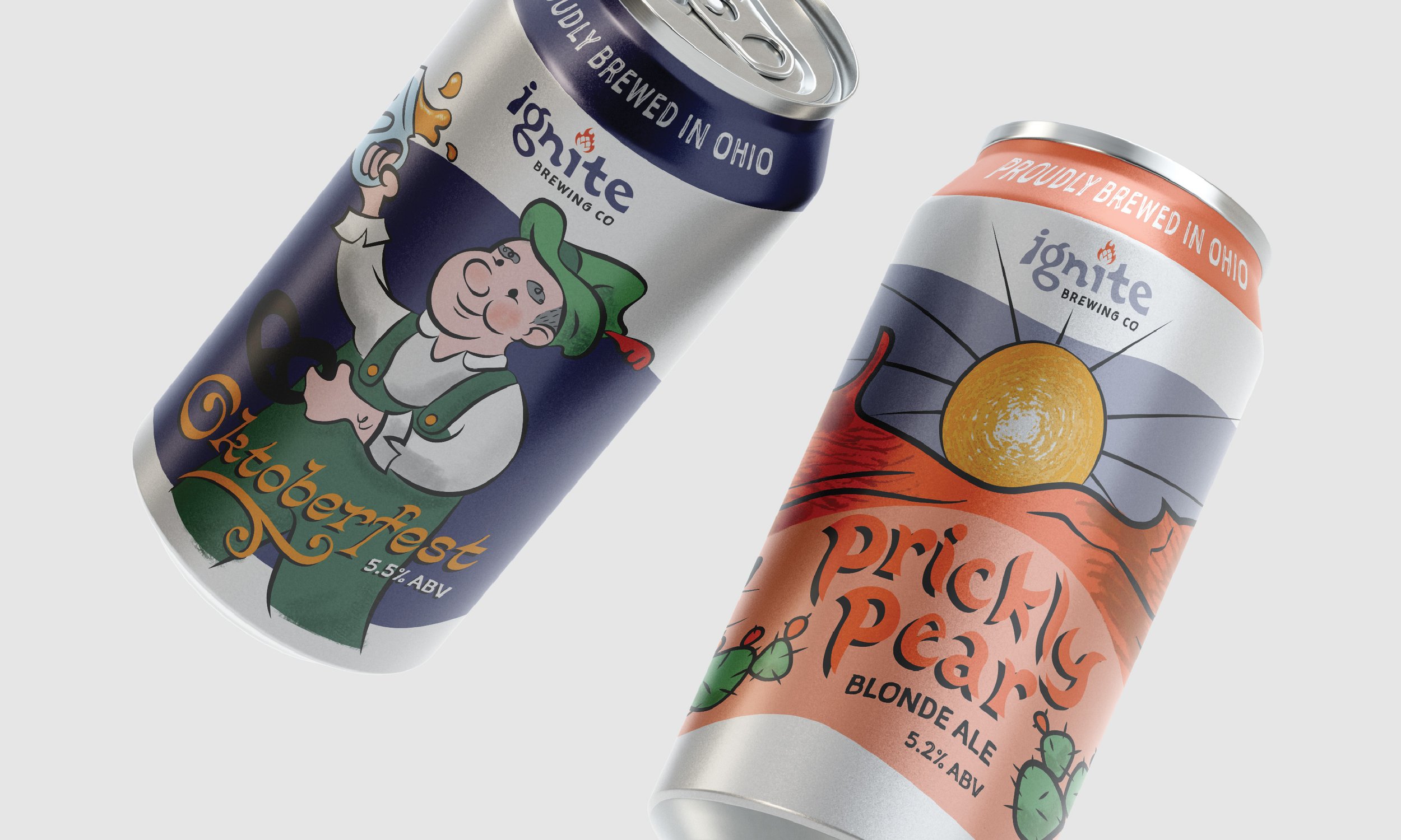
When it comes to the adult beverage aisle, you need to be able to capture attention among the hundreds of other cans competing for attention.
One way to have your brand stand out is by using colorful illustrations - sometimes a more playful and cartoonish route helps the design stand out on the shelf and lead to more sales.
making a unique & flexible logo
A good logo should be unique - we thought that a custom typeface would be a good stepping stone to setting the brand apart.
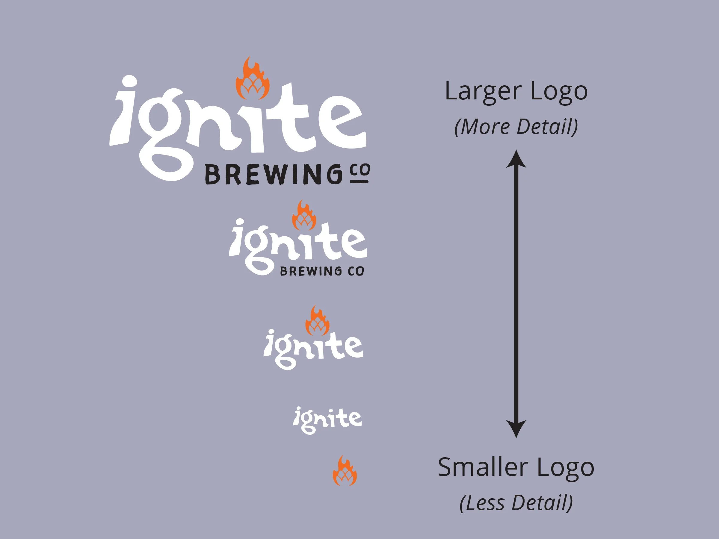
A good logo should be scalable - this means that we can still recognize the brand regardless of whether the logo is on the side of a building vs the side of a can.

